"أتمنى أن لا يُدرك الناس فورًا أنني أستخدم كرسيًّا متحركًا." هذه الفكرة، التي أعرب عنها أكثر من ٦٠٪ من المشاركين في استبيان أجرته شركة بايتشن على مستخدميها، تكشف عن شعورٍ خفيٍّ لكنه منتشرٌ على نطاق واسع. وعلى الرغم من أن الكراسي المتحركة الكهربائية أصبحت أكثر قدرةً بكثير، فإن التحيُّزات الاجتماعية المتعلقة بمظهرها لا تزال راسخةً—فهي تتمثَّل في الأنابيب البيضاء السريرية، والإطارات المربَّعة الشكل، والمظهر الوظيفي البحت. وهذه العلامات البصرية تُصنِّف المستخدمين دون وعيٍ على أنهم "مرضى" أو "ضعفاء". وتؤكد شركة بايتشن أن التغلُّب على هذا التحيُّز الجمالي يتطلَّب ليس فقط تحسينات تقنية، بل إعادةً جذريةً للتفكير في المظهر الذي ينبغي أن يتحلَّى به الكرسي المتحرك.

العبء الخفي الناجم عن التحيُّز الجمالي: يختار المستخدمون الاندماج مع المحيط
في دراسة نوعية أجرتها مختبر الخبرة التابع لشركة بايتشن:
اعترف عددٌ كبيرٌ من المستخدمين بأنهم يختارون أحيانًا الكرسيَّ المتحرِّك اليدوي أو العصا المشيَّة—اللذين يُنظر إليهما على أنهما «أقل طبيَّةً»—بدلًا من الكرسيِّ المتحرِّك الكهربائي في المواقف الاجتماعية مثل اللقاءات العائلية واجتماعات العمل والمواعيد الغرامية.
وقال بعض المستخدمين إنهم يتجنَّبون تناول الطعام خارج المنزل أو التسوُّق ببساطة لأن لون كرسيِّهم المتحرِّك «أبيضٌ جدًّا كأبيض المستشفيات».
وأفاد أكثر من ٨٠٪ من المستخدمين الأصغر سنًّا (تحت ٣٥ عامًا) بأنهم يرغبون في تصاميم قابلة للتخصيص، على أقل تقدير توفر خيارات ألوان إضافية بجانب الأسود والأبيض والفضي.
وقال أحد المستخدمين البالغ من العمر ٣٢ عامًا والمصاب بالتصلُّب المتعدد: «في كل مرة أدخل فيها المصعد على كرسيِّي المتحرِّك الكهربائي الرمادي الفضي، كان الجيران يلقون عليَّ نظرات شفقة ويطرحون سؤالاً كهذا: ‹هل تذهب إلى المستشفى مرة أخرى؟› وكنتُ في الواقع أتوجَّه فقط لشراء فنجان قهوة. وفي النهاية، فضَّلتُ أن أمشي ببطءٍ لوحدي بدلًا من مواجهة تلك النظرة المُحرِجة.»
وهذه حالة كلاسيكية تُعرف بـ«تهديد الصورة النمطية». فعندما يوحي مظهر الكرسي المتحرِّك بشكلٍ صارخٍ بأنه «كرسي مريض»، فإن المستخدمين يستوعبون هذه التسمية داخليًّا ويتراجعون عن المشاركة في الحياة العامة.
من أين تأتي التحيّزات؟ الإرث المُهين للتصميم الطبي
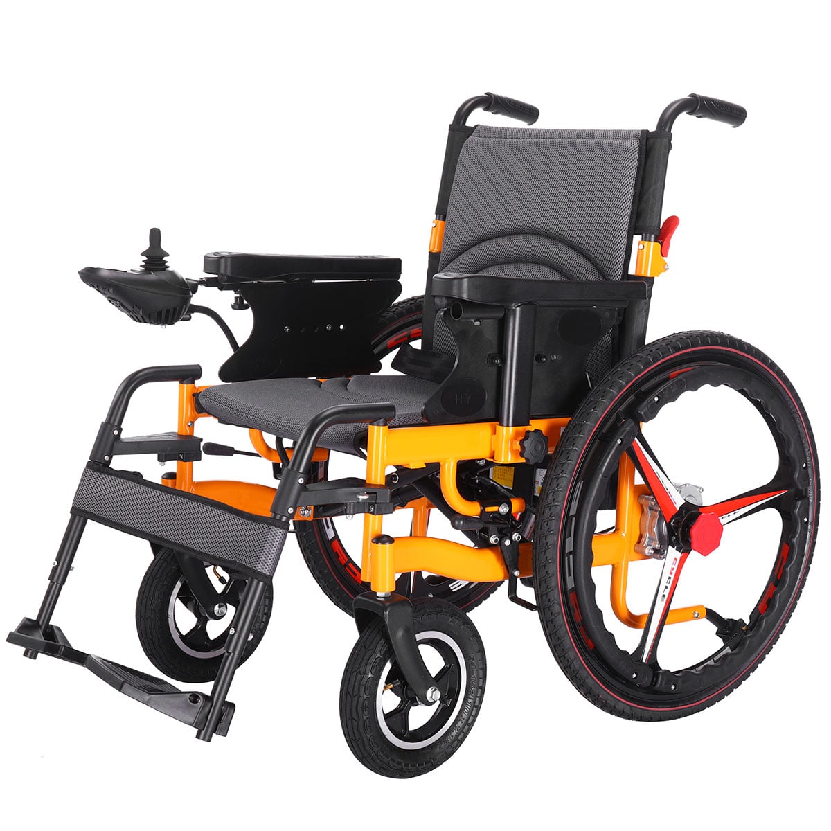
صُمِمت الكراسي المتحركة التقليدية تقريبًا بشكل حصري من منظور سريري: أبيض أو رمادي فاتح لدلالة "النظافة"، وأنابيب مكشوفة لدلالة "القوة"، ومقاعد كبيرة جدًّا وهيكل ثقيل لدلالة "الاستقرار". ولا شيء من هذه العناصر خاطئ في حد ذاته، لكنها معًا تخلق طابعًا جماليًّا باردًا ووظيفيًّا يتجاهل الاحتياجات العاطفية والاجتماعية للمستخدم.
والقضية الأعمق هي أن القطاع تعامَل منذ زمنٍ طويل مع الكراسي المتحركة باعتبارها "أجهزة إعادة تأهيل" بدلًا من كونها "أجهزة شخصية للتنقّل". فالتصنيف الأول يصوّر المستخدم على أنه مريض، بينما الثاني يراه إنسانًا يتمتّع بالقدرة على اتخاذ القرار وأسلوب خاص به. وبمجرد تصنيف الكرسي المتحرك على أنه "جهاز طبي"، فإن مظهره يوحي تلقائيًّا بـ"الشذوذ".
كيف تتحدى شركة بايتشن الوضع القائم
١. ثورة في الألوان: التحوّل بعيدًا عن "اللون الأبيض الطبي"
شاركت شركة بايتشن مع خبراء الألوان لإطلاق لوحة ألوان «مستكشف المدن»، التي تشمل اللون الأزرق منتصف الليل، والأخضر الزيتوني، والرمادي الرملي الدافئ، والوردي الضبابي، والأسود غير اللامع — وهي ألوان مستوحاة من ملابس الحياة اليومية وديكورات المنازل، وليس من ممرات المستشفيات. وتُظهر الاستبيانات أن رغبة المستخدمين في الخروج للمرة الأولى ازدادت بنسبة تزيد على ٥٠٪ بعد اختيار لون غير طبي. وقال أحد المستخدمين لنا: «لقد تلقّيت إطراءاتٍ على كرسيّي المتحرك الوردي من زملائي في العمل — والآن أصبحت أستمتع فعليًّا بدفعه عبر المكتب.»
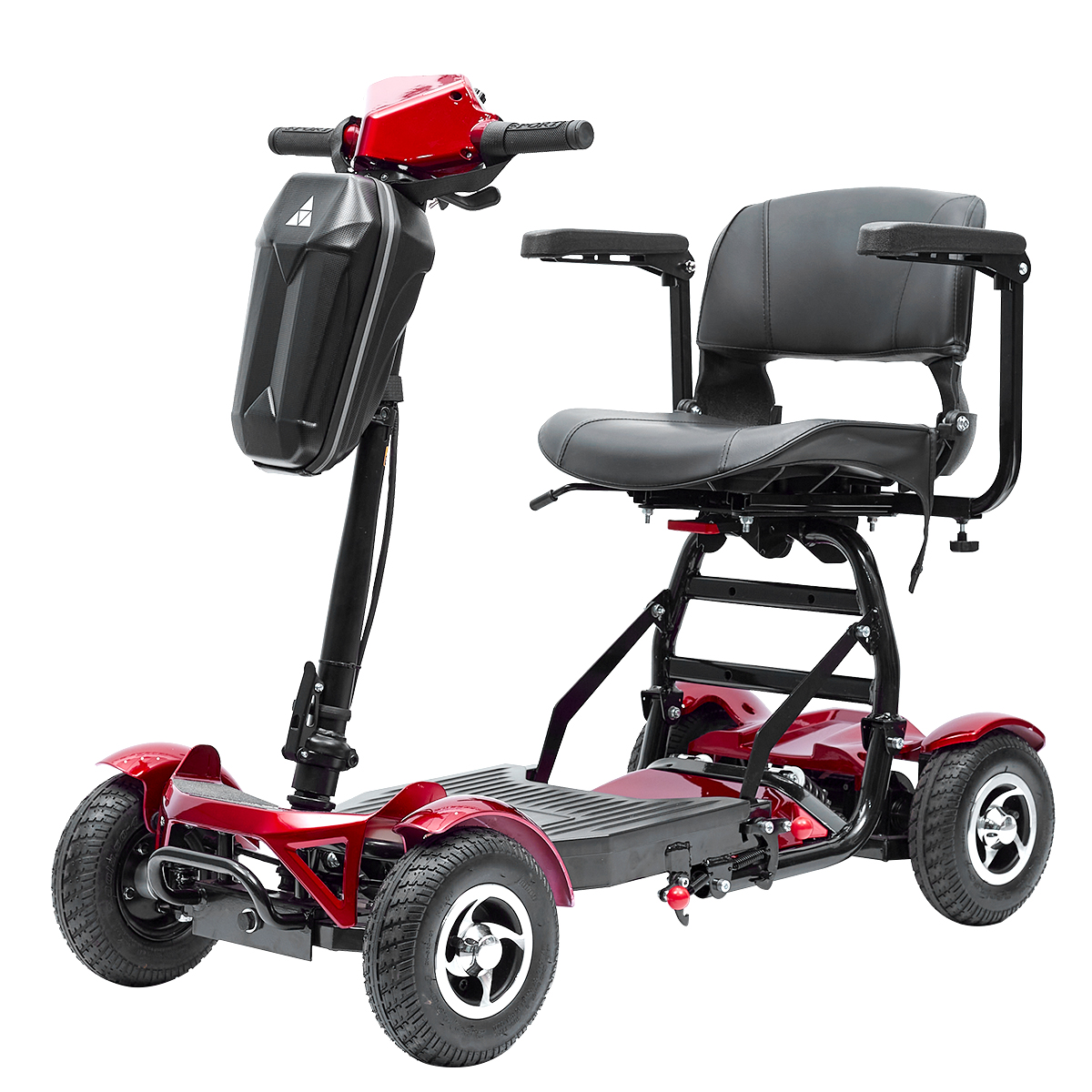
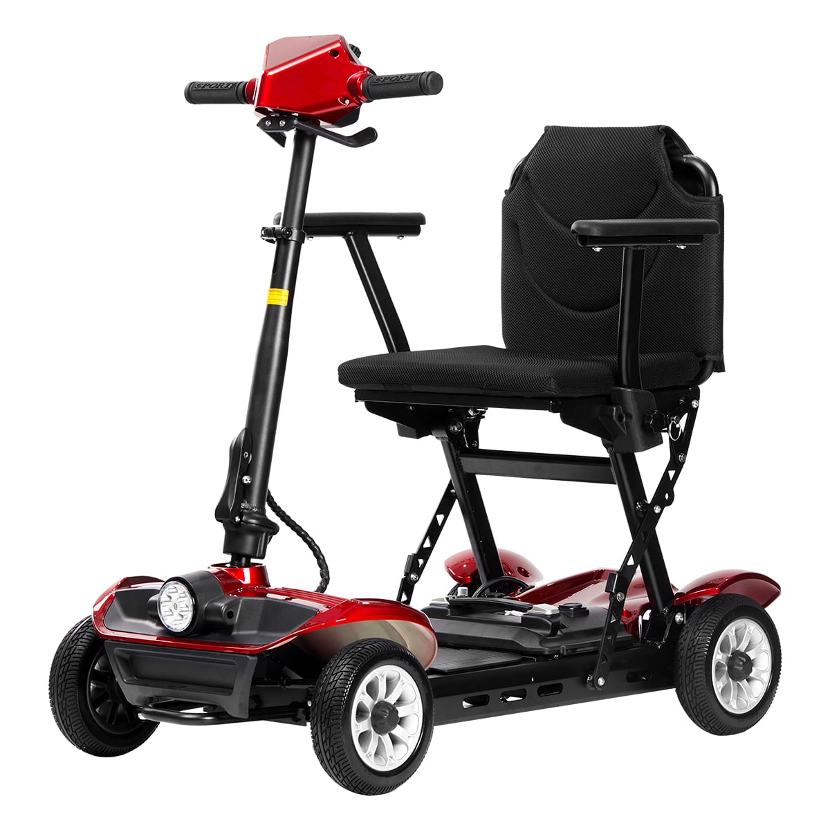
٢. لغة التصميم: خطوط ناعمة، هيكلٌ مخفي
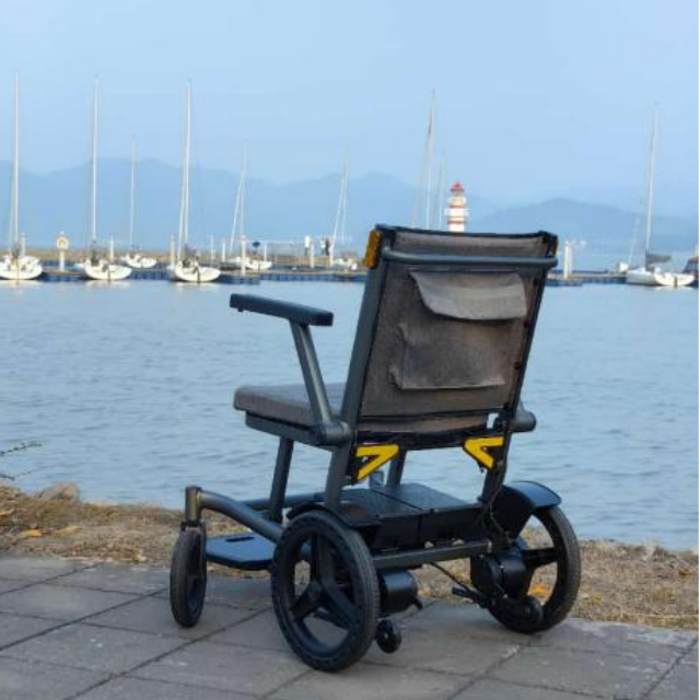
تبدو الكراسي المتحركة التقليدية وكأنها هياكل عظمية مكشوفة. أما سلسلة بايتشن الجديدة المصنوعة من ألياف الكربون فهي تستخدم غلافًا مُصَبوبًا وحيدًا يخفي معظم الأنابيب الإنشائية. وبشكل عام، فإن المظهر الخارجي لهذه الكراسي يشبه المركبة الكهربائية الحديثة أو قطعة أمتعة فاخرة، لا سرير مستشفى. كما تم إخفاء البطارية ووحدة التحكم داخل الهيكل الأساسي، مما يلغي وجود الأسلاك الفوضوية والخطافات الخارجية.
٣. ألواح قابلة للتبديل: دع المستخدمين يعبّرون عن أنفسهم
في بعض الموديلات المختارة، تقدّم شركة بايتشن ألواحًا زخرفية قابلة للتركيب باستخدام التثبيت المغناطيسي، يمكن للمستخدمين تبديلها وفقًا لمزاجهم أو فصل السنة أو مناسبة معينة. وتتراوح المواد المستخدمة بين ألياف الكربون الاصطناعية والفلين والقماش أو طبعات صور مخصصة. وبذلك، يتحول الكرسي المتحرك من جهاز طبي ثابت إلى لوحة فنية تعبّر عن الهوية الشخصية.
نداءٌ موجَّهٌ إلى القطاع: التصميم العادل ليس رفاهية
worldwide، يستخدم أكثر من ١٣٠ مليون شخص في جميع أنحاء العالم كراسيًّا كهربائية متحركة أو سكوترات كهربائية. ويواجه معظم هؤلاء الأشخاص ضغطًا يوميًّا ناتجًا عن طريقة نظر الآخرين إليهم. وأحد أكثر السبل فعاليةً لتخفيف هذا الضغط هو المنتج نفسه — فإذا بدى الكرسي المتحرك «عاديًّا» أو «يوميًّا» أو حتى «جذّابًا»، فإنه لا يلفت الانتباه غير المرغوب فيه بعد ذلك.
في شركة بايتشن، نؤمن بأن التصميم الجمالي ليس زخرفةً غير ضرورية. فعندما يشعر المستخدم بمزيد من الثقة في الخروج إلى الخارج لأنه يحب لون كرسيه المتحرك، فإن ذلك يُشكّل قيمة اجتماعية حقيقية.
نطلب من زملائنا: هل يمكن أن يتضمن منتجكم القادم لونًا غير تقليدي؟ هل يمكنكم إخفاء بضعة أنابيب إضافية؟ وهل يمكنكم طرح سؤالٍ على المستخدمين مثل: "ما الأسلوب الذي تفضّله؟" بدلًا من السؤال فقط: "ما العرض والارتفاع اللذين تحتاجهما؟"
التزام شركة بايتشن: إطلاق مبادرة "إلغاء التصميم التقليدي"
وبدءًا من هذا العام، ستلغي شركة بايتشن لون "الأبيض الطبي" كلون افتراضي لجميع الموديلات الجديدة، وتوفر ما لا يقل عن ستة ألوان بديلة. كما أطلقت الشركة أيضًا أداة تخصيص الكرسي المتحرك عبر الإنترنت، حيث يمكن للمستخدمين الاطلاع مسبقًا على الألوان المختلفة والملصقات وتصاميم الألواح قبل إتمام الطلب.
ونحن نؤمن بأن اليوم الذي لم يعد فيه الكرسي المتحرك يُظهر مظهره التقليدي هو اليوم الذي تبدأ فيه الصور النمطية السلبية بالانحسار فعليًّا.
زُر الموقع الرسمي لشركة بايتشن لتجربة أداة التخصيص أو مشاركة قصتك. وكل خيار تقوم به يُسهم في دحض الصورة النمطية القديمة.
نينغبو بايتشين لأجهزة طبية المحدودة،
+86-18058580651
Baichenmedical.com
 EN
EN
 AR
AR
 BG
BG
 HR
HR
 CS
CS
 DA
DA
 NL
NL
 FI
FI
 FR
FR
 DE
DE
 EL
EL
 IT
IT
 JA
JA
 KO
KO
 NO
NO
 PL
PL
 PT
PT
 RO
RO
 RU
RU
 ES
ES
 SV
SV
 TL
TL
 IW
IW
 ID
ID
 LV
LV
 LT
LT
 SR
SR
 SK
SK
 SL
SL
 VI
VI
 HU
HU
 TH
TH
 TR
TR
 FA
FA
 GA
GA
 CY
CY